Sean Lee | Product Design Lead | San Mateo, CA
Usage Explorer

The Usage Explorer helps Illumina customers track and manage their software usage costs with control. Customers use iCredits, Illumina’s digital currency to pay for storage and computing cost of their informatics software. However, the old system lacks clarity and details, making cost management difficult.
As the lead UX designer, I initiated to uncover pain points, defined a strategic vision, and delivered design solutions in an agile, fast-paced manner to align with product goals. As a result, it immediately improved the overall experience, and the initial launch has already sparked strong enthusiasm among customers.
Problem:
Hidden Costs, Zero Visibility
"One thing about cloud is people get surprised how much it costs. You only pay for what you use but people tend to use a lot."
This user research quote underscores the major issue with the old usage app as many customers wondered, 'Why Illumina always charges us more than we anticipate?'. Customer found the old app lacked visibility and transparency without details regarding their software usage costs. Accessing an intuitive usage tracker is significant to Illumina's customers because it incurs costs when they need to fully utilize their software products.
Based on the research, it was clear that the old app was not meeting the user expectation as they encounter difficulties in comprehending their software usage due to:
-
Limited access: Usage information was only available in the Admin Console, restricting visibility to domain admins only, who often are not always the ones managing usage for each workgroup or project.
-
Lack of transparency: The page lacked clarity, and the terminology used was confusing, making it difficult for users to comprehend.
-
Poor UX: Provided only basic, flat-level data without custom date range and detailed insights, making it impossible for users to analyze patterns or compare usage effectively.
-
Low engagement: Due to these issues, many users saw little value in the page, resulting in low traffic.
Define & Iterate:
From Hypothesis to Team Alignment
After identifying the problem, I defined a hypothesis that the team aligned on:
"We believe that providing all users—not just domain admins—with clear insights into their software usage patterns will empower them to track, manage, and plan their software usage costs more effectively. We'll know this is true when users can better plan their software consumption and purchases, resulting in fewer negative credits balances."
And then, I facilitated a workshop with the cross-functional teams, including a product manager, lead developers, customer support, and data analysts. The objective was to align on uncertainties and drive ideation toward a shared solution.

This is a screenshot of affinity map from the workshop using Miro. The team realized that fixing the issues requires a complete overhaul of the current experience. Under my strategic guidance, we’ve identified three key focus areas for MVP: usage breakdown, filter, and budget.
Conceptual Model:
Right Information for the Right User
One issue with the current usage app is that it’s restricted to domain admins only, making it inaccessible to those responsible for managing usage costs. To address this, we’re expanding access to all users and implementing role-based content hierarchy, ensuring admins see more detailed data while end-users have access to relevant usage information.

I documented all my work in Confluence as the source of truth, which I call UX Wiki. Here’s a draft of the persona analysis based on research from UX Wiki. Along with the qualitative insights from research, we used the structured design process to validate the decision to open access beyond domain admins, including workgroup admins and individual users who need visibility into usage consumption.

It’s important to note that the information hierarchy of the new usage app is defined according to the user’s role and their interaction with the usage data. Some usage contexts are only relevant to admins and won’t apply to end-users. I’ve broken it down into usage information and corresponding actions for each role. While it may seem less exciting, this step is crucial before moving into design and execution.
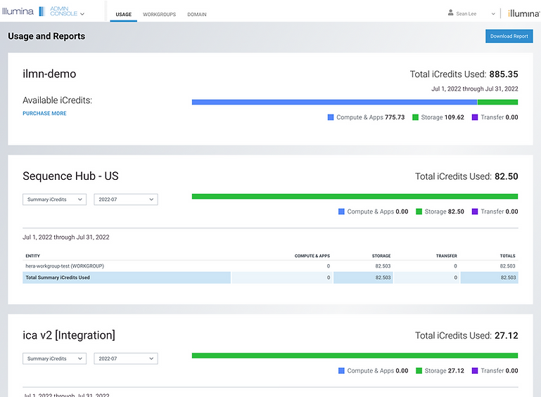
Usage Explorer:
Transparency and Control Into Every Layer
Once we identified the problem and key focus areas, we defined user needs and built a clear structure. From there, I began design exploration, starting with rough sketches and refining the concept through multiple iterations and team reviews until ended up a high-fidelity prototype that we felt confident in.

The redesigned experience follows a structured flow, guiding users through details of their usage by:
-
Expanded accessibility: Now a standalone app available to all users, not just domain admins. Information and actions are tailored based on each role.
-
Information hierarchy: Designed for immersive experience with three key components:
-
Summary: A snapshot of iCredits balance, spending patterns, and usage budget controls (below).
-
Trends: Interactive data visualizations with dynamic filters for usage pattern over custom date range.
-
Details: Granular breakdowns of usage consumption based on context with search, column filters, and CSV export options.
-
These improvements enhance clarity, providing a transparent view of software usage costs helping users not only understand total balance and usage in domain level, but also the details of breakdown by where it was used, and who used it over their preferred selection of date range.

We've also responded to strong customer demand for better usage spending management by introducing a Budget Notification feature. As highlighted in the workshop, this feature allows users to:
-
Set up a monthly recurring iCredit spending limit.
-
Allocate iCredits per workgroup, product, or project.
-
Customize low iCredit notification thresholds (as shown in the prototype).
-
Define recipients who should receive email regarding low iCredit balance alerts.
With this enhancement, customers can not only monitor their usage but also actively manage it with greater control, all within the Usage Explorer. Defining targeted recipients for the low iCredit balance email was highly advocated during concept research to raise awareness by ensuring the right individuals, rather than just default domain admins were notified and responsible for managing the situation.
Outcomes:
Validated by Users, Ready to Scale
After finalizing the high-fidelity prototype, we felt confident it met user needs and quality UX design metrics. I collaborated with a researcher to conduct rigorous usability testing, ensuring the design functioned as intended before handing it off to developers. After deployment, We also conducted another round of alpha testing when the product was ready for further evaluation. The results showed a drastic improvement, meeting multiple areas of user needs. Here are some of the quotes:

While we have a long-term plan to incrementally refine and integrate other features for a more seamless experience, this MVP release already represents a significant improvement over the old app. We're confident it will immediately help users track and manage costs more effectively.
Play the video (try full-screen for better visibility) to see a screen recording of our Beta launch of the Usage Explorer, including the onboarding walkthrough.
Related Projects:
-
See customer interaction with informatics software in the Microarray analysis setup workflow.
-
Explore the end-to-end experience of setting up software in the Software registration & onboarding.