Sean Lee | Product Design Leader | San Mateo, CA
Software Registration & Onboarding

For customers who purchase Illumina’s bioinformatics software, registration is the final step before they can begin analyzing data. In practice, what should take hours was taking weeks, sometimes consuming most of the 30-day trial period before a single analysis could run.
As the sole UX designer, I led the end-to-end redesign of the software registration and onboarding experience across the entire activation journey, from the first post-purchase email to account login and the registration portal itself. The goal was simple: help customers reach value faster by removing friction at every step and reducing the time it took to activate their software.
The solution was not a single redesign. It required three coordinated interventions - each targeting a different friction point across the activation journey - ultimately reducing activation time by 4×.
Discovery:
Mapping the Friction

To diagnose the breakdown between purchase and registration, I mapped the end-to-end journey and identified the root causes involved. I found that the "registration gap" was not a single failure point, but a series of disconnects between three distinct user groups. Each held a different piece of the puzzle, yet none had the clear guidance or unified tools needed to complete the process.
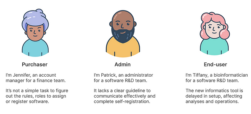
Once the root causes were identified, I created lean personas to highlight key user groups and their pain points during the software registration onboarding process.
Once the root causes and targeted user groups were identified, I facilitated a design workshop with cross-functional teams, including the product manager, developers, subject matter experts like scientists, and customer support team. The goal was to align on the problems and generate ideas to meet the design goal, "Streamline the registration process through an improved end-to-end experience".
Friction Point 1:
The Email Nobody Acted On
Research revealed that the registration email, the customer's first prompt to act was failing on three fronts: it was buried in the wrong email, sent to the wrong person, and too poorly designed to inspire confidence or action.

The current email communication was ineffective for several reasons:
-
Mixed with order confirmation: Registration instructions were embedded in order confirmation emails, which customers typically skim as standard purchase receipts. Since many products don’t require software registration, the instructions were often overlooked.
-
Wrong recipient: These emails were frequently sent to purchasers, who research showed are often not responsible for completing software registration.
-
Poor design and accessibility: The outdated template lacked clear messaging and CTA, and the yellow font failed accessibility standards, negatively affecting both usability and brand perception.
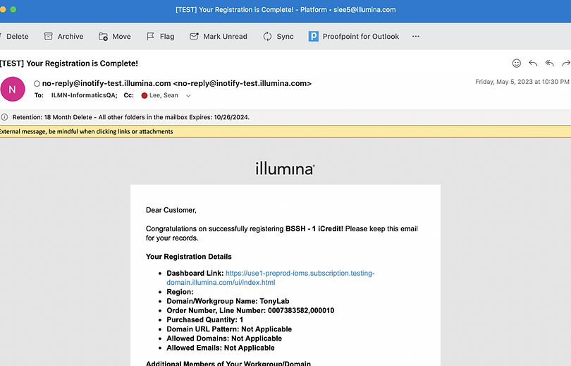
To make things worse, an auto-registration feature - designed to simplify the process under certain conditions was quietly adding to the confusion. When triggered, it sent two separate emails for the same order: one requesting manual registration and another confirming auto-registration had already occurred. The emails differed in both style and language, giving customers no clear signal about what had actually happened or what they needed to do next.

Three changes transformed the email from something customers ignored into something they acted on:
-
Registration-specific email: I separated registration emails from order confirmations for better clarity.
-
Targeted recipients: By using a user data model build by registration history, sales team input, and insights from an onboarding survey, I ensured registration details reached the right registrants.
-
Design enhancement: I redesigned the email template for improved branding, consistency with the design system, and clearer messaging with a strong CTA.
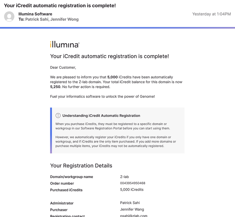
For auto-registration, I consolidated the two conflicting emails into one clear confirmation. The redesigned email immediately tells customers their software is registered, explains what auto-registration means in plain language, and surfaces the relevant details - eliminating the confusion that previously led customers to take no action at all.
Across both email types, the redesign increased initial engagement at the first touchpoint and established a standardized template that extended beyond registration to all software-related communications going forward.
Friction Point 2:
The Login That Turned People Away
When users receive the registration email, they are prompted to click the “Register Software” button, which redirects them to the Software Registration Portal for completing the process. However, a major pain point was that many users got stuck in the login screen due to authentication failures.

When redirected to log in, users instinctively use their private domain credentials, as their software subscriptions are tied to that domain. However, the Software Registration Portal operates on a separate domain with different login credentials which leads to failed login attempts, causing frustration and delays in the registration process.

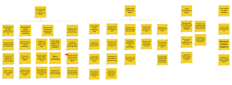
This story map exposed the full complexity of the login problem across differernt user personas - each with a different entry point, different credentials, and a different way of getting stuck. It made clear that a single login fix wouldn't work. The solution needed to account for every scenario from first-time signup to multi-domain access.

This flow map defined how the new unified login experience should work across every scenario - single domain, multiple domains, direct URL access, and first-time signup. It became the blueprint that aligned engineering and product on exactly what needed to be built before a single screen was designed.
The solution was a unified login experience backed by a centralized identity and access management system - one credential, one entry point, across all platforms. Customers could now log in without needing to know which domain their account belonged to or which product they were trying to reach.
Beyond registration, this redesign extended to the full signup experience and marked a significant brand transformation across all Illumina products, impacting every customer on the platform.
Friction Point 3:
A Portal That Made Simple Things Hard
Even after making it through the email and login, customers still had one more obstacle - the registration portal itself which lacks clarity and usability, causing confusion about managing pending orders.


Three issues made the portal harder to use than it needed to be:
-
Lack of clear guidance: It lacked clear instructions on what the registration entails, what actions users need to take, and how to complete without help documentation.
-
Restricted rules and roles: It forced only specific type of admins to complete the registration, causing confusion for users when different individuals are responsible for the task in their organization.
-
Repetitive steps: The three-steps process spread across three separate pages was unnecessarily complex and redundant as user need to repeat the steps when there are multiple pending orders.

Before launch, I ran an onboarding survey to determine whether registration should be restricted to specific admin roles. The data was clear - 29% of users responsible for completing registration were non-admins. That finding directly informed our decision to open registration to anyone with responsibility for the task, regardless of their system role. The survey also fed into the data model used to route registration emails to the right recipients.

The new design streamlined the workflow by making key design changes:
-
Clear language & CTA: Refined wording to clearly communicate required actions. This also led to introducing customer-facing help documentation for the first time - a gap that had existed since the portal launched.
-
Open to anyone responsible: Registration is no longer restricted to specific admin types. Customers can now assign whoever is actually responsible within their organization, eliminating the role confusion that previously blocked progress.
-
Single-page workflow: Three configuration steps spread across three separate pages were consolidated into one. Users with multiple pending orders no longer need to repeat the same process from scratch for each one.

The portal redesign solved the immediate registration problem but it revealed a bigger opportunity. Users still had to juggle multiple disconnected apps to register software, view subscription status, and manage access security. Each task lived in a different place, creating a fragmented experience that undermined the work we'd just done.
I led the design of Connected Home, a unified platform hub that brought all of these capabilities under one roof. By consolidating the apps and redesigning the information architecture and navigation from the ground up, we delivered a seamless all-in-one solution - extending the impact of this project well beyond software registration.
Outcomes
Fixing those friction points across the journey produced results that had eluded the team for years, and ultimately helped customers streamline their registration process, leading to numerous benefits.
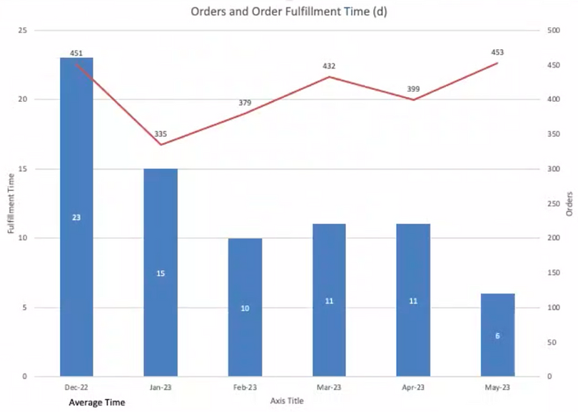
The data tells the story directly - average order fulfillment time (from purchase to registration) dropped from 23 days in December 2022 to 6 days by May 2023, a 4x improvement on a problem that had persisted for years.
-
Faster registration: Reduced order fulfillment time from weeks to days meant customers could start using their software almost immediately after purchase.
-
Higher software usage: Faster access translated directly into more analyses run and more storage consumed, driving measurable increases in software usage revenue.
-
Improved trial conversion: Shorter activation time meant 30-day trial users kept more of their trial period, contributing to a higher conversion rate from free trials to paid annual subscriptions.
-
Platform-wide brand impact: The unified login/signup and new email templates didn't just fix registration - they set a new standard for how Illumina communicates with and onboards every customer across the platform.
Taken together, these improvements didn't just streamline a process - they rebuilt customer trust at the most critical moment in the product journey, right at the start.