Sean Lee | Product Design Lead | San Mateo, CA
Service Connect

Nearly 60% of The Home Depot’s home services leads begin with a conversation on the store floor. But the tool associates relied on to capture those leads made it difficult to find the right service while standing with a customer.
I led the end to end UX design of Service Connect, an enterprise application within The Home Depot’s Home Services ecosystem that helps associates connect customers with trusted local service providers and ultimately helped drive the highest lead generation rate the business had seen.
Discovery:
Understanding Store Associates
When I took on the store experience within the Home Services ecosystem, I did not start with designs. I started with questions. Who are these store associates? What does their day actually look like? And what happens when a customer is standing in front of them ready to book a service?
Through role play exercises, persona development, and journey mapping, I built a ground level understanding of how associates help customers navigate home services in the store. A survey of store associates then validated where the experience was breaking down and pointed us toward a clear problem to solve.

I facilitated this role play exercise during the discovery kickoff with product managers, engineers, and other stakeholders. By stepping into the roles of both store associates and customers, the team built a shared, ground level understanding of how service requests unfold on the store floor and where friction appears in that moment.

These personas were developed from field research and operational insights, including input from support center agents who work closely with store associates every day. They gave the team a shared understanding of our primary users and became a reference point throughout the project.

A survey of store associates confirmed what we were hearing in the field - 28% cited difficulty finding the right service as their biggest pain point, making it the most common complaint by a significant margin. The data gave us a clear, evidence-backed focus: findability wasn't just a usability issue, it was directly impacting the business's ability to capture leads.

With findability confirmed as the core problem, the journey map gave us precision - pinpointing exactly where in the associate experience the breakdown was happening. The Find stage was our entry point. Everything that followed was built around making that moment faster, clearer, and more intuitive for associates.
Design Exploration:
Shaping the Solution
Knowing the problem was not enough. We needed to determine what was worth building. Before committing to any direction, I led a series of collaborative exploration activities with the team, including brainstorming sessions, design sprints, and early concept sketching. The goal was to explore the solution space broadly, pressure test ideas early, and build shared understanding so that when we narrowed our focus, the team was aligned on why.

Bringing product managers, engineers, researchers, and stakeholders into the same room was intentional. Aligning diverse perspectives early helped surface assumptions and reduce surprises later in development. During this full day sprint, we pushed beyond obvious solutions, challenged ideas together, and left with a set of design concepts the team had collectively shaped and felt confident moving forward with.

These early sketches and wireframes were the first tangible expressions of our solution ideas. Rough enough to invite honest feedback, but detailed enough to spark real debate. Through multiple critique sessions with the team, I refined and narrowed the concepts, using feedback to remove what was not working and strengthen the ideas that showed the most promise.
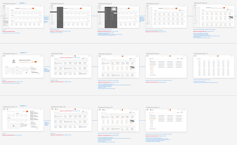
After several rounds of exploration and reviews, I narrowed the direction to three design concepts, each with distinct approach to solving the findability problem. With the content strategy and feature set validated, the next question became clear: which navigation model and interaction pattern would work best for associates on the store floor? There was only one way to answer that question. We put the designs in front of real users.
Validation:
Prototype Testing with Store Associates
With several design concepts in place, I partnered with the senior researcher and conducted multiple rounds of usability testing across different store locations. Using methods including 1:1 interviews, mystery shopper exercises, and large-scale surveys with hundreds of respondents nationwide, we turned each round of feedback into a sharper, more focused design.

4 rounds of testing. 10 prototypes. 60 associates across 16 locations. 400 survey respondents nationwide. This research summary captures what we learned and how it shaped the work - validating features that were ready to ship, surfacing edge cases we hadn't anticipated, and identifying high-value opportunities that went straight into the backlog for the next phase. The scale of this research wasn't just due diligence - it gave us the confidence to make bold design decisions and bring stakeholders along with evidence rather than intuition.
Solution:
Solving Service Findability
Rather than waiting for a perfect solution, we took a deliberate incremental approach - releasing each improvement as it was validated through testing and backed by analytics. This kept the experience moving forward without disrupting associates mid-workflow, and allowed us to learn from real usage at each step. The result was a series of focused, high-impact features that collectively solved the findability problem from multiple angles.

Search - MVP
These screenshots show the new Search design we launched as our MVP. On first launch after the update, users see a tooltip overlay highlighting the improved Search (left). When they click into the field, the overlay dismisses and they transition seamlessly to the existing home page (right), with the new Search prominently active by default. The redesign increased search engagement from 8% to 28% within just 24 hours of release.

Recently Requested
In-store user research revealed that the associates frequently submit recurring service leads tied to their department. For example, kitchen consultants often submit leads for Kitchen Remodel or Cabinet Refacing services. To support this behavior, I designed a “Recently Requested” feature that surfaces common submissions, allowing associates to complete repeat tasks more efficiently.
Data showed the feature reduced task completion time by 50%, achieved the highest success rate among available methods, and earned a 4.7/5 likelihood-to-use score from 374 surveyed users.

Popular Services
Initial concept testing showed associates responded well to Popular Services - but positive feedback alone wasn't enough to justify building it. I went back to the data to validate the assumption before committing to the direction.

Mixpanel data from 5 randomly selected stores confirmed it - just 12 services generated 75% of total leads at each location. The analysis also uncovered location-specific and seasonal patterns, with demand shifting based on geography, time of year, and even local events. The case for building Popular Services was clear.

Browse
With Search and Recently Requested in place, the next challenge was browse - helping associates navigate confidently across 300+ services without losing their way. I worked with the product team to rethink the service taxonomy from the ground up, reorganizing categories for clarity and designing a tile layout with an expandable drawer that made the full catalog feel approachable rather than overwhelming.

With the success of the new tile design, we expanded its use across other Home Services platforms, including Pro Referral Pro and Home Depot’s consumer website. This showed how a well-designed solution could scale across platforms to benefit both consumers and enterprise users.
Outcome:
Measurable Impact

What began as a findability problem ultimately reshaped the Service Connect platform. By shipping improvements incrementally across desktop and mobile, each validated feature closed the gap between where associates were struggling and where the business needed them to succeed.
The results were clear: a 25% increase in lead generation and 5× growth in web traffic to the Home Services consumer website, producing the highest lead completion and submission rates Service Connect had ever seen.
Beyond the numbers, the project demonstrated how investing in the associate experience can unlock value across the entire ecosystem. When associates can quickly find the right service, customers are connected to the right professionals faster. That chain, from a single search on the store floor to a completed home improvement project, is where the real value of the platform lives.
For the complete Home Services Ecosystem, check out Pros and Consumers experience.